I shall be
a bit shorter than what was the original plan. It is partly because I really am
not an expert in contemporary art, and partly because I have had an extremely
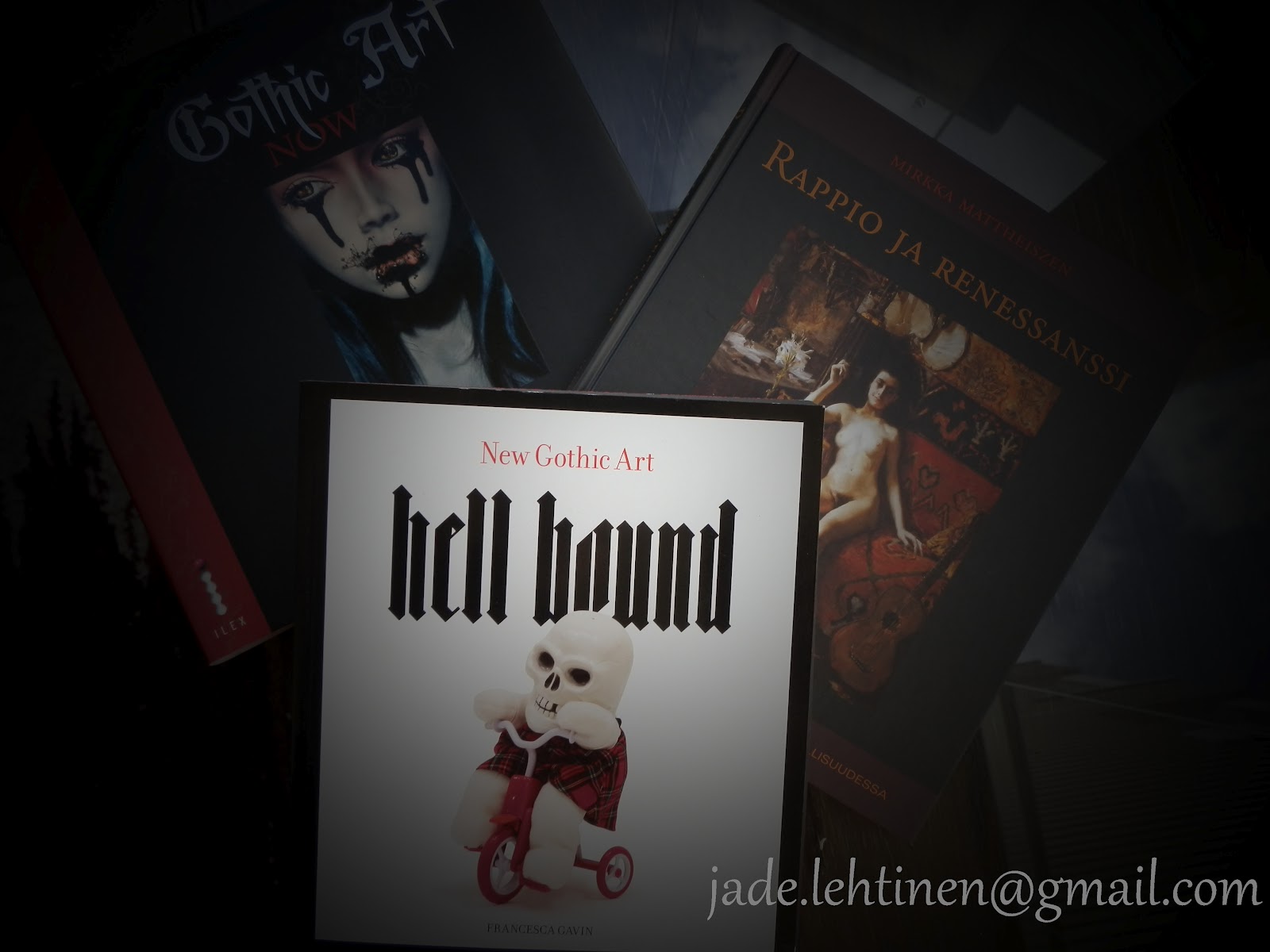
busy fortnight. As I said, next is Hell Hound: New Gothic Art by Francesca Gavin.
In this
book there is no chapters per se. There is an introduction and the artists. What is
to be noticed is that Gothic is not used as a synonym to Goth (as a
sub-culture) it has certain similarity, but it is not representing the
sub-culture or it's collective view of art.
I am going
to aggravate a tiny bit, to make the differences between books more visible and
also perhaps to stir some objections.
As said,
compared to the earlier book, Gothic Art NOW, there is no chapters, or one
could say each artist is a chapter. In Gothic Art NOW the artworks presented
are more the popular view of what does Gothic (in the sense of being submissive
to the term Goth) art look like. There was a point, that some of the artist
presented in Gothic Art NOW do not consider themselves to be goths or their art
to be gothic.
In Hell
Hound I think it is even less that way. In the introduction term Gothic is almost
reduced to mean the same thing as fear. The artists introduced are somehow
dealing with fear, politics and society or the concept of art itself in their
work.
Of coarse
it is quite visible why goths like these artists, or why people in general
consider them to be presenting dark aesthetics. There is a certain sinister
allure in the artworks mentioned whether they are paintings, video
installations or statues. I can't say I instantly fell in love with every
artist or liked every work, but they do give a bigger picture of all art that
could be considered gothic or even goth.
The variety
of styles, methods and concepts is remarkable considering the way Gothic Art
Now presented different works of art, or artists.
Nevertheless,
I strongly recommend to explore both of the books I shortly presented.
Next time: Degradation and Renaissance: Decadence in Finland's Fine Arts and Literature
I like the way you write about art books! As you might gathered, I'm not quite fond of Victoria Frances, and gothic kitsch.
ReplyDeleteNoir comics are my weak point, someone even said, I look like a caracter from them...
http://papirmozi.blog.hu/media/image/PO_1_1.jpg
The other favourite is "Scared Little Lily," even Edgar Allan Poe is in them! I!ll read it every night for my kid. :D Here is the first page.
http://galeria.index.hu/kult/2011/07/22/lakatos_istvan_vilaga/2258616_f5845f8d5bbfe5a1e7a0fe295369fbd4_l.jpg
Thank you for the compliment! :) I too am sometimes a bit fed up with the cutie-gothy kitsch. I guess it is because of my age, that I'm nowadays more classic noir and corpgoth oriented in style.
DeleteThose comics you linked seem really interesting, makes me wish "Scaird Little Lily" would be in English too! Considering all those accessories you've blogged about, I don't wonder people say you look like from a noir comic. :D And I mean that as a huge compliment, since you've got a style other people imagine when the create a cool character!
Hey Jade,
ReplyDeleteI stumbled upon your blog, and look like we have some similar interests (and similar points of view upon literature). I know it's not "everyone's cup of tea", but you may find this one interesting:
http://www.kickstarter.com/projects/213177064/asylum-playing-cards
http://www.facebook.com/AsylumPlayingCards
https://twitter.com/AsylumWorks
I really appreciate all effort which you put in the blog, and would be thrilled to hear some comments and constructive words of criticism.
Cheers,
Milan (fellow artist from Serbia)
I'm not sure if I am anyway qualified to say anything, since I am not an artist. But I think those playing cards you have made are really pretty, I like the art deco feeling. You are talented and what I would suggest is that you would make also the smaller cards (2-10) pictures too. A bit like in some editions of tarot cards, you know? Or just something small, that can be seen in some but not in all of the smaller cards. Like a spooky twist, people could ponder about, asking "why is 4 of spades looking different from others, like the 6 of dimes? Why those have this small mark in them?"
DeleteOf course that would mean a lot of more work, but it could bring that extra value for the buyer.
Thank you for reading my blog!